
Markus Reuter asked us to design a new identity for his blog Better Taste Than Sorry — where he writes about anything that inspires him: life, food, people, places, ideas, street-art, music, bikes, furniture, brands, friends etc. etc.
Creative Concept / Corporate Identity / Logo Design / Typography / Stationery / Letterpress / 2011
That’s why we came up with a quite intuitive and even ‘rough’ kind of logo-system that’s supposed to be exactly like the blog itself: varied, spontaneous, situational and very personal ...
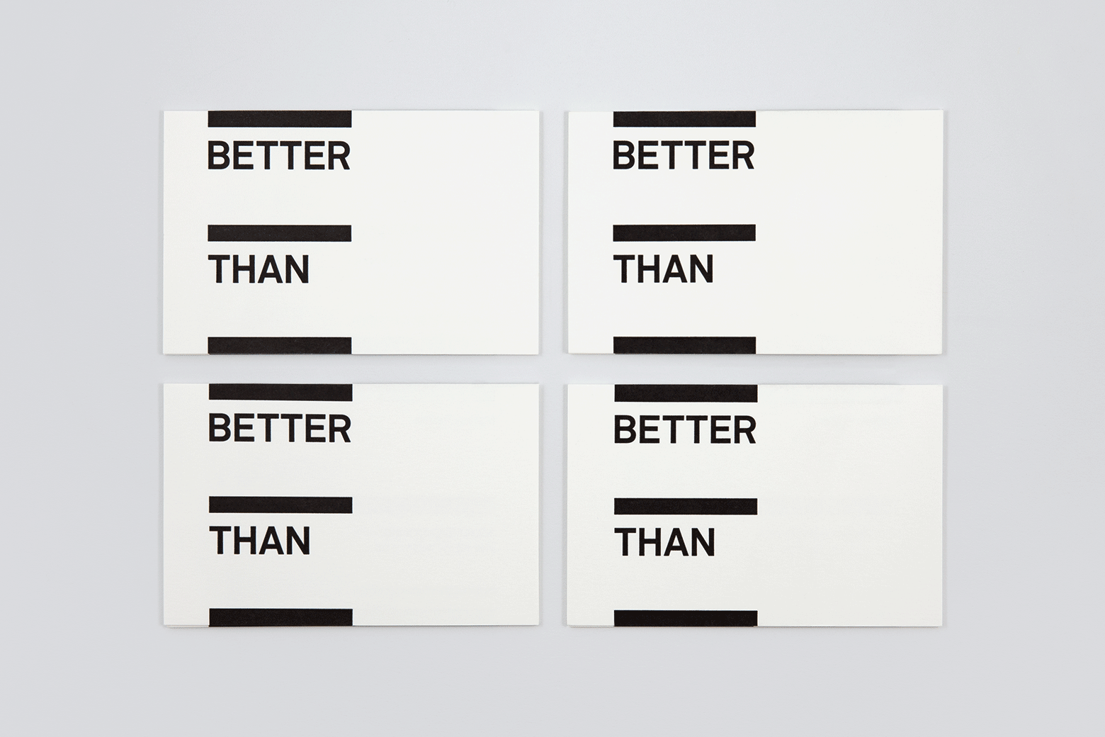
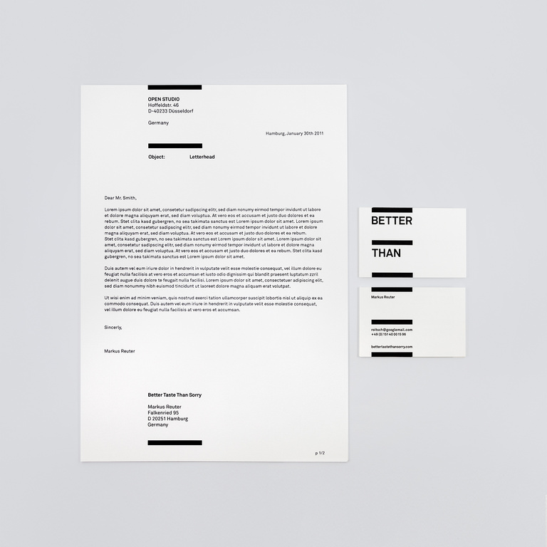
Print: Letterpress
Colours: 1-C Black
Paper: GMUND Original Smooth Blanc
Business cards printed by Letterpress77