
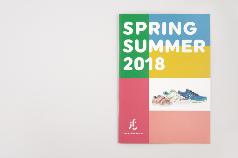
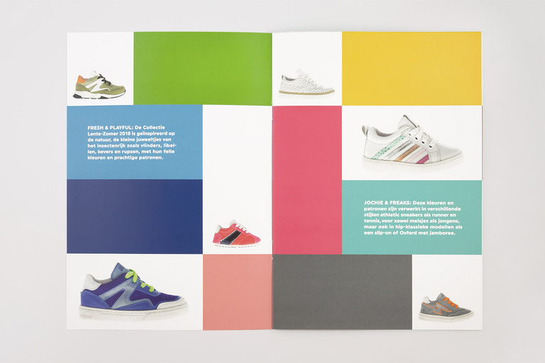
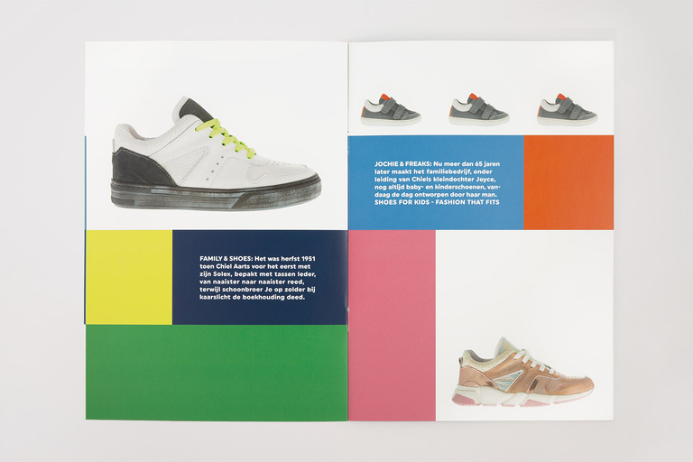
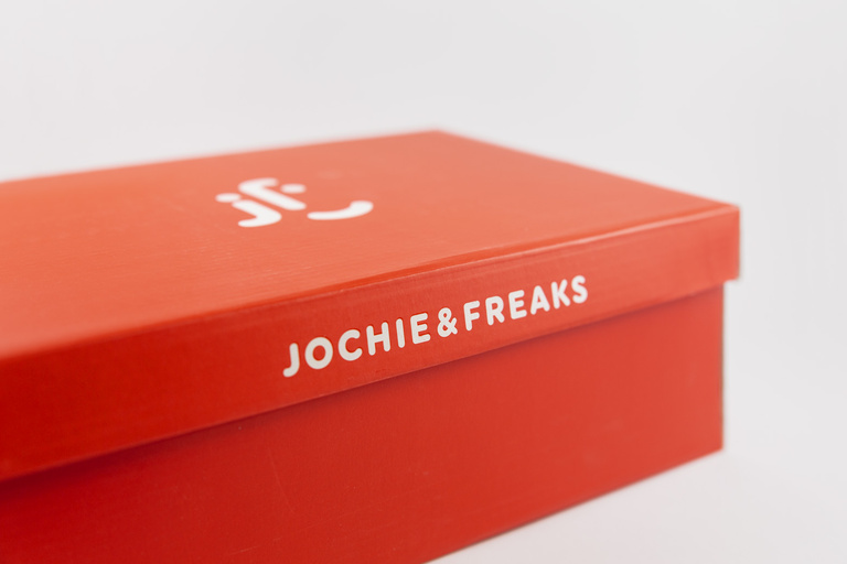
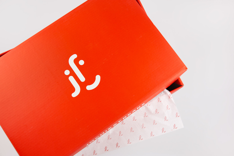
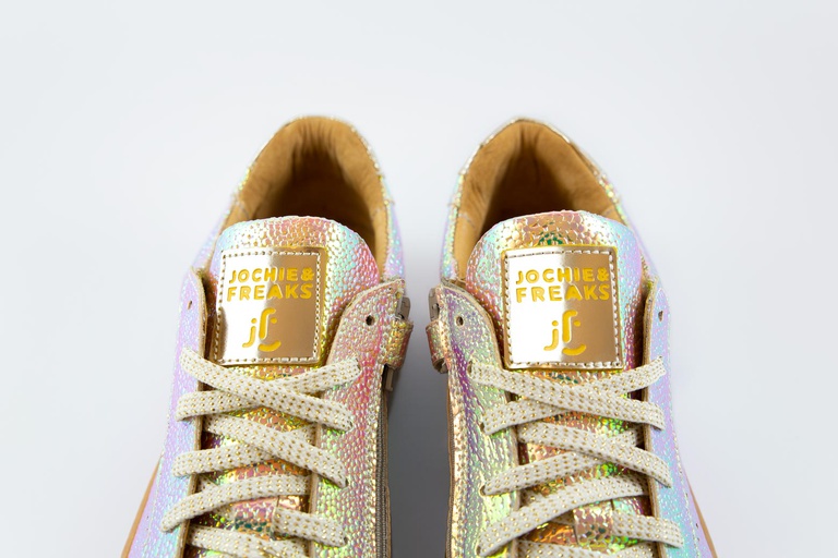
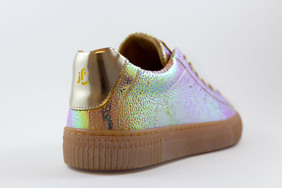
Logo design, packaging, lookbook and website facelift for Netherlands-based kids shoe company ’Jochie & Freaks’. The task was not only to give two existing brands (Jochie / Freaks) one new and common face but to also create a fresh, playful and even stylish look to spread the brand’s new motto:
Shoes for kids – fashion that fits.
Corporate Identity / Creative Direction / Branding / Logo Design / Editorial Design / Packaging / 2017 - 2018

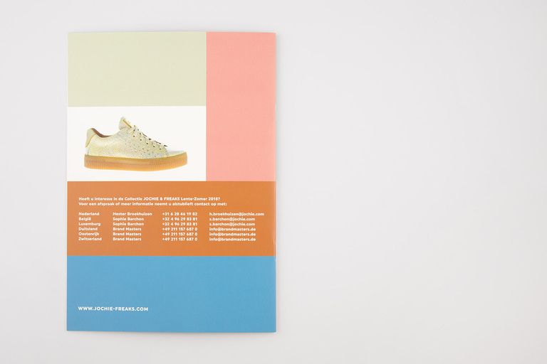
Print Booklet: Offset
Colours: 4-C
Paper: phoenixmotion Xenon