Contribution to PAGE magazine’s official ‘Touch the Logo’ competition …
Creative Concept / Logo Design / Re-Design / Typography / Competition / 2018
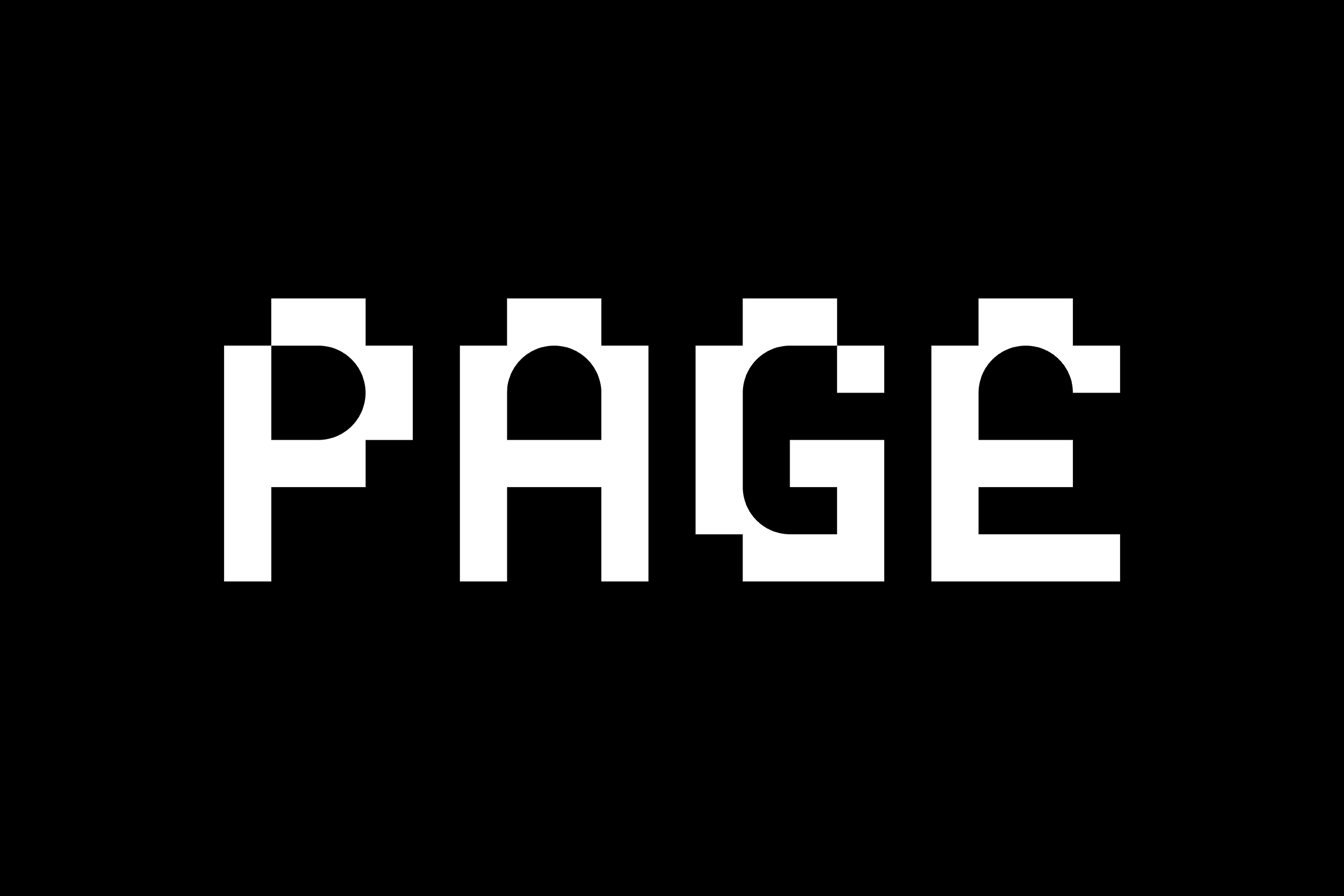
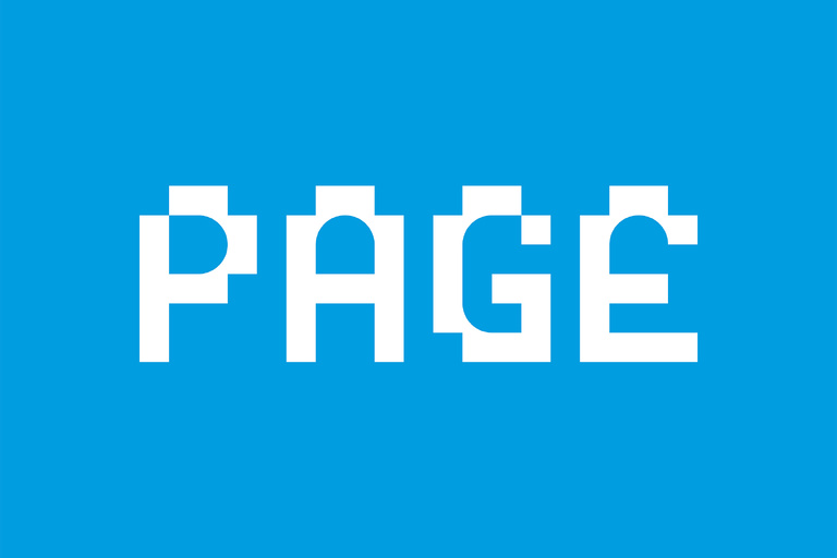
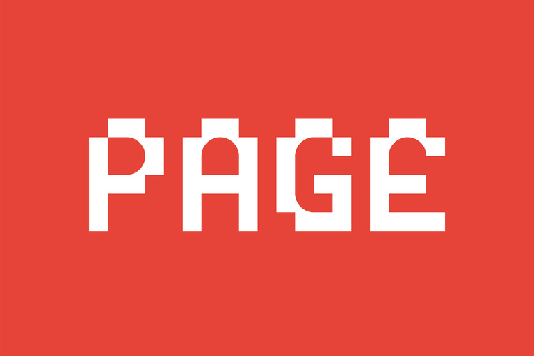
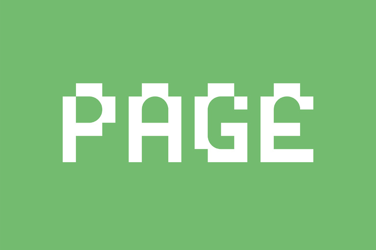
Our aim was to create a minimalistic logotype that combines the analogue and the digital – as PAGE itself does (not only with regards to content but also in the form of a monthly printed magazine and daily refreshed online platform). To underline those specific aesthetics, the whole logo concept is constructed on two basic shapes: the circle (to illustrate the analogue world) and the square (as a symbol for the smallest addressable element in the digital universe: the pixel).
The result is a clean and playful logotype – a true ’hybrid‘.